ING
Introduction
ING decided on a complete overhaul for their online banking services back in 2017. One of the main reasons was that the technology across the whole stack was severely outdated.
With all the developments in the financial world, like the rise of many disruptor banks and PSD2 (read more about PSD2 here), it meant the pressure was on. To stay relevant in the digital age, ING had to improve their digital offering.
My role
As Design Lead, I was responsible for the output of 30+ designers all working on the various products of ING within multidisciplinary scrum teams. I also supported the core banking team as a hands-on designer.
As you can imagine it can be quite a challenge to ensure a seamless and consistent experience for such a large site with complex processes and products. My approach consisted of three pillars:
Develop design principles and framework
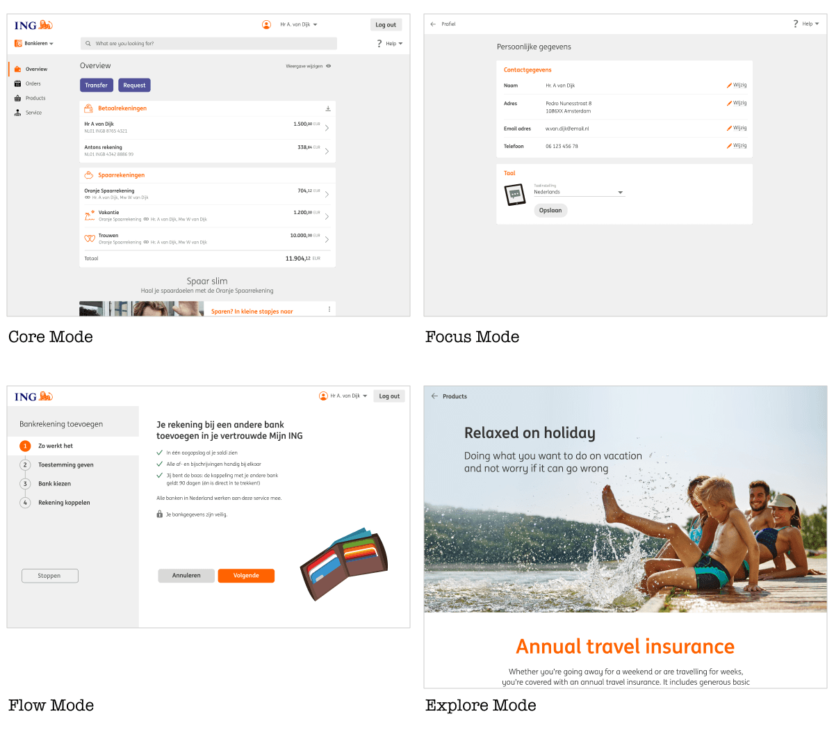
To ensure we didn’t end up with a Frankenstein website, where each page or flow would have a slightly different behaviour and look and feel, I worked with our Art Director and a bunch of Senior Designers on a Design Framework. The framework offers a set of modes (loosely defined templates) that are based on a customer’s job to be done. Each mode has its own set of guidelines and page templates. On the lowest level, the templates are built with predefined library components.
The four navigation modes
The four modes, as displayed above are:
Core mode, for navigation between main banking products.
Focus mode, for small tasks, such as setting a card limit.
Flow mode, for larger tasks, such as applying for a loan.
Explore mode, for checking out new products.
For example, if a designer needed to create a sign-up flow for a new product, they could use the ‘flow’ mode to build this flow. The guidelines for this mode would give them enough structure to ensure their flow would be consistent with others, but also enough freedom to cater to the flow’s specific needs.
2. Design Ops
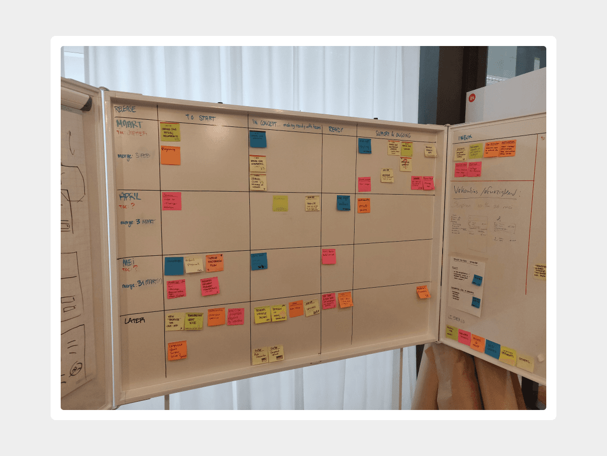
As Design Lead I had to oversee the design output of multiple teams (20+ teams). To keep track of the work being done, I organised a fortnightly 'Design Board' session. In these sessions, each designer (and their scrum team) had the opportunity to get feedback. I also expected them to give an update on the project or feature and to be able to answer a few basic but fundamental questions:
What is the user need that this feature will solve / support?
To what extent are your solutions based on user insights?
Do you have an hypothesis? What is it - what would you expect once this feature is launched?
The ING Omnichannel Design Board
Besides the Design Board I would run design coaching sessions with designers, to give them guidance and collaborate with them on tough problems. Where possible I would also advise them on how to handle 'tough' teams or stakeholders.
Stakeholder management was an important task for me as well. As I had to deal with many teams, I tried to do regular check ins with the most important stakeholders at a regular basis. My main goals were to get a better understanding of their goals and issues and to figure out how I could help them in the best way possible.
3. Design Process
Obviously, product design is not a linear process, where success is guaranteed as long as you dutifully follow the recipe. It is a process full of unknowns, where a humble and curious attitude and a healthy dose of determination and focus will get you there in the end. Nevertheless, a framework or process is helpful, if only to give structure and help to communicate to people outside the team on what's going on.
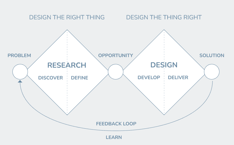
As I worked with so many designers, teams and stakeholders it was useful to have a simple and known process in place. The double diamond was the obvious choice, as it covers all the necessary steps.
The ING Omnichannel Design Board
Discovery
The discovery was an ongoing process, getting insights from various sources:
Frequent qualitative user studies: both user interviews and usability studies.
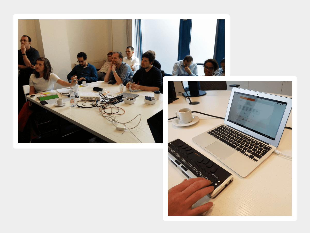
Usability studies with people with a disability, to better understand and cater for A11Y.
Metrics: what are people doing, what are they searching, how do they navigate?
In context micro surveys and feedback forms on the digital banking website.
Customer support: what are the current issues customers run into?
Then there was often pressure from various stakeholders within ING. They often had goals (for example sell more products) that were understandable, but not always in line with customer needs. It was my job to find a good balance between business goals and user goals, without compromising too much on the experience.
Doing user research with users with a disability
Then there was often pressure from various stakeholders within ING. They often had goals (for example sell more products) that were understandable, but not always in line with customer needs. It was my job to find a good balance between business goals and user goals, without compromising too much on the experience.
EXAMPLE - IMPROVING SEARCH
We knew from the metrics and qualitative studies that Search was used a lot. Unfortunately, our Search was still fairly simple. For instance, it couldn't handle complex queries (something people would do, as they are used to Google being able to handle that). Also, the results were hit and miss, often not answering the user's question.
One of the ambitions was to have a Search that could handle input in a natural language way, and understand context. For example dates were used a lot by our customers, as they often were looking for a specific transaction. Same goes for amounts. But our simple Search parsed both of these queries as standard strings, with often unwanted results.
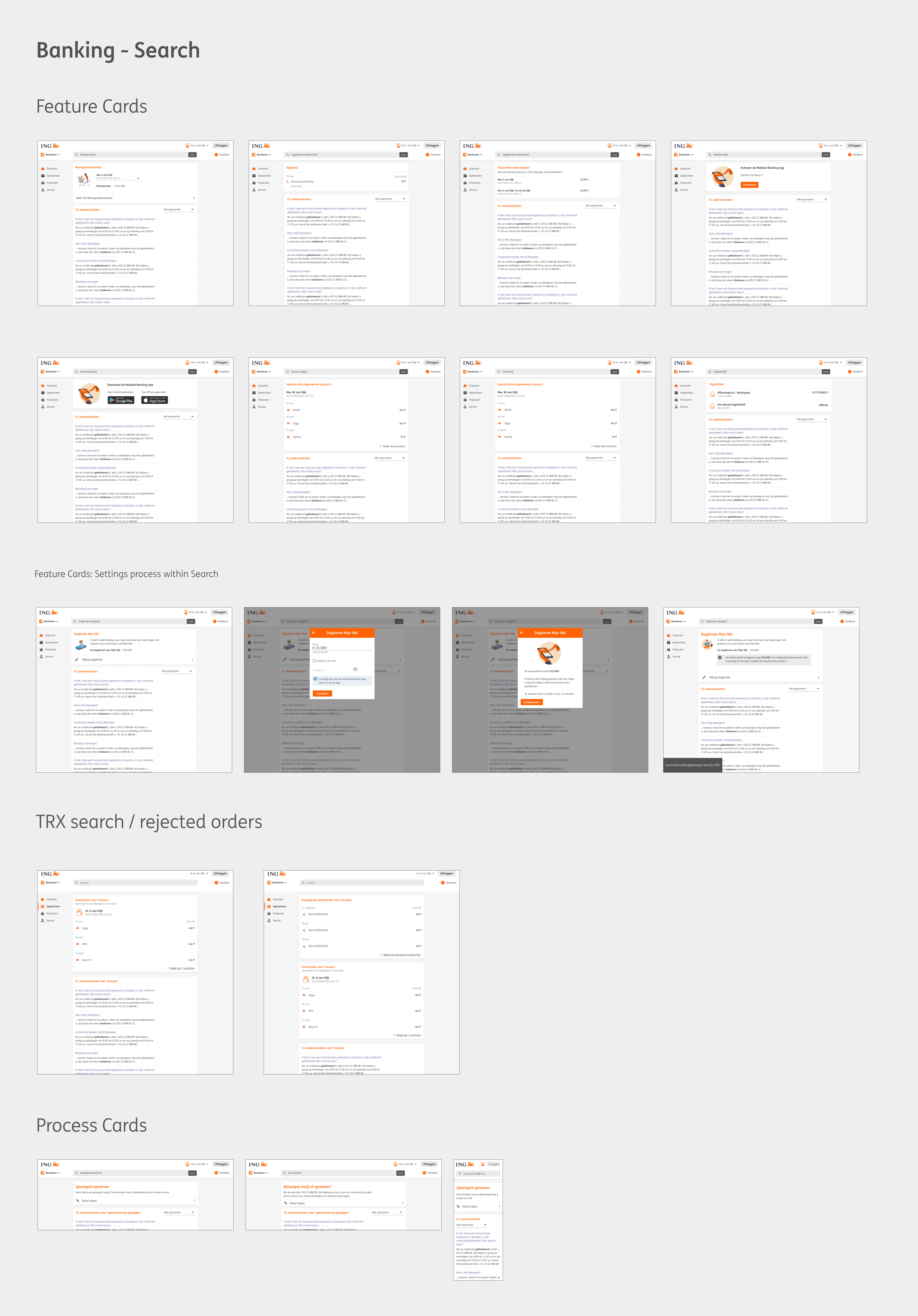
Different Search Queries displaying results in a 'feature card'
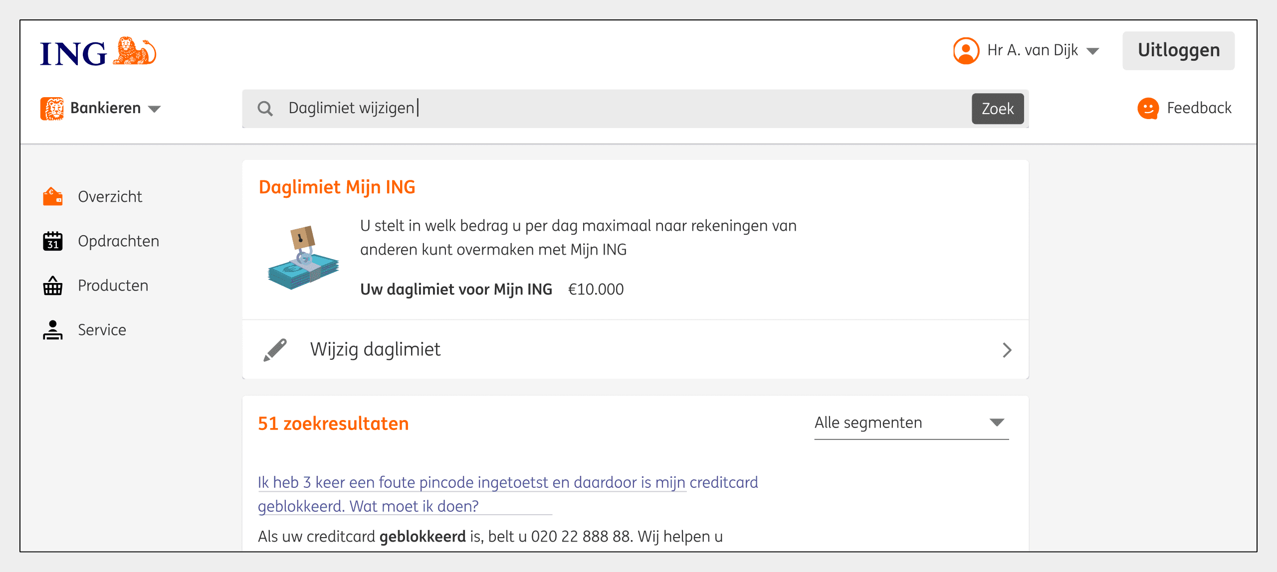
Detail: Search result with feature card
Having our Search understand context and language was our ‘Big Hairy Goal’ and would take significant effort and time to achieve.
To avoid the waterfall trap of working on something for 6 months resulting in something that does not quite meet the customer needs, we worked on small improvements. Every sprint we would deliver something new and add value to the product.
This was based on user data - what are people searching for the most, what do they need the most. With this iterative approach we could slowly but surely improve the product while not losing ourselves in immense complexity.
Design & Develop
In the design phase I would experiment with different solutions. Sometimes they were just sketches, and sometimes I would already create a rough prototype together with a developer, just to get a feel for the interaction, but also understand technical complexity from early on, especially if we needed to change something in the API.
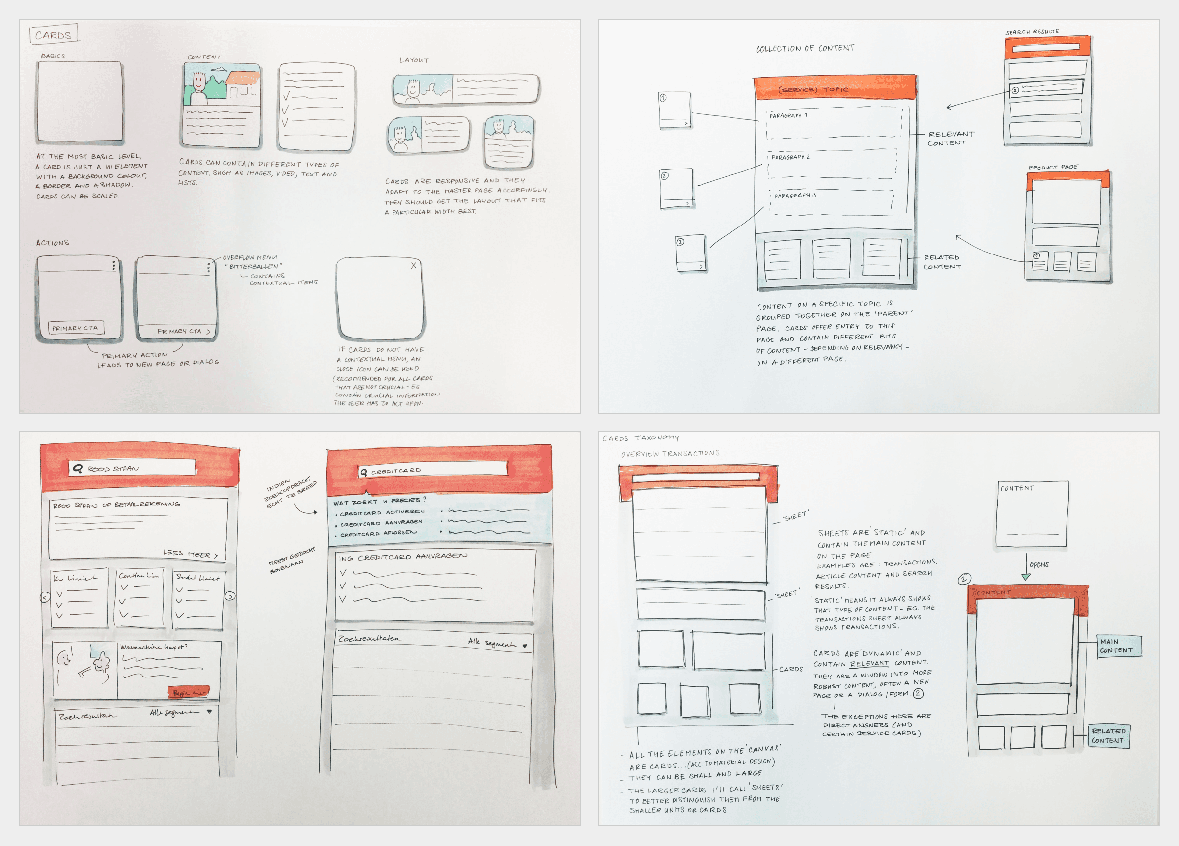
The big advantage of sketches is that it takes little time to visualise multiple ideas, allowing you to collect feedback early and often.
Examples of sketches I did for various features
Post-launch learning and improving
In my book, a launch is not the end stage of a product development process, but a start. It’s the time to put our hypothesis to the test and learn from real usage.
Based on the input coming on mentioned in the Discovery step, I use this to further iterate on the product. Or sometimes you need to know and understand more.
For example you see in the data that a specific feature is hardly used. But you don’t know why, so you need to investigate. Perhaps by tracking more events, or by doing a qualitative study. It really depends on the situation what you need to pull out of your UX Toolbox.
The important part here is to remain curious, and having the will to learn and improve.
